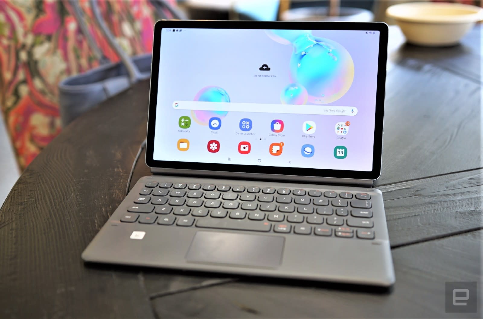
Samsung also made the buttons a little deeper than before and added a function key so you can use it to trigger shortcuts that have been added to the top row. On the old keyboard, this row simply had numbers and symbols that you could trigger by pressing downshift. Now, you can also get Escape, Dex and Delete if you hold down Fn and press the `, and backspace buttons, respectively. As for the rest of the keys in that row, using Fn with them will give you F1 to F12 for things like opening a new tab or refreshing a webpage. I’d prefer if Samsung put controls for display brightness and volume here, but I suppose I have to be thankful for the little improvements here.
I have some lingering complaints. The buttons are still a little too small, especially the backspace key. I end up having to reach a lot farther than I’m used to and end up hitting instead. When I’m holding down the Shift key in an animated bout of all-caps typing, the space bar doesn’t work. I’ll end up with a stream of words tied to each other so it looks even more incoherent when I’m digitally screaming at the world. Also, the horizontal-arrow keys don’t always work — they’re useless in a URL bar, for example.
These may have more to do with the Tab S6’s software than the keyboard itself, which brings me to another one of my biggest annoyances with Samsung’s tablets: Dex.
Dex mode still needs work
Oh, Dex. Where do I begin? On the Tab S6, Dex is a software interface that mimics a full desktop experience, allowing you to pull up all your apps in windows. You can resize these panels and overlay them on each other. It all sounds like a great idea, except my early experiences with Dex really burned me. There was a lot of inconsistency around whether the browser app was pulling a desktop version of a site and which apps had been optimized for the desktop environment.
Samsung has since refined the software, and it’s a very subtle improvement. Apps behave more like I expect them to on a desktop, although you’ll have to make a lot of tweaks for them to truly run like they should. For example, you’ll need to enable the “Force apps to resize” setting in Dex Labs before you can maximize every window you open. Some apps will also have to relaunch when you switch between Android and Dex modes, which takes a few seconds.
Also, Chrome still doesn’t automatically load the desktop version of websites, and for some reason, there are two screenshot shortcuts on the taskbar. Two! One is the native Android screenshot button, and the other is a special Samsung one. Even if one is much better than the other — like maybe it pastes rainbow unicorns all over your screenshots or something — why include both? Why not just have the better one in there?
I would also like to see some interface changes. When I use the Alt-Tab shortcut to switch between apps, for example, the highlight over the selected app is really faint, and I can’t really tell which app I’ve toggled to. A bolder color scheme would make this much easier to see at a glance. I’d also like the name of the app on each window’s title bar so I don’t have to guess. Also, sometimes clicking on a browser tab closes it, even when I tapped nowhere near the X button!
It’s all these little annoyances that make Dex still feel unreliable. Even though it’s more stable — in that it crashes less than before — I still want it to be better.
Performance and battery life
Aside from failing to provide a reliable desktop multitasking interface, though, the Tab S6 is a sturdy performer. Its Snapdragon 855 processor capably handled my workflow, which typically consists of Slack, Gmail, Chrome, Calendar, Docs, Twitter and a few other apps. It also held up when I pushed it further by sneaking in a session of Cooking Dash, which typically lags a bit on my Pixel 3.
I was also pleasantly surprised by the Tab S6’s battery life — it made it through a recent two-day journey from Germany to New York, including an eight-hour flight, with plenty of juice to spare. On our battery test, it lasted 15 hours and eight minutes, beating its predecessor by three hours. That’s also better than the iPad Air and the 12.9-inch iPad Pro, though just shy of the Surface Pro 6’s 15-1/2-hour result.
Wrap-up
With its kickstand, keyboard and wannabe desktop interface, the Tab S6 is Samsung’s latest attempt at mimicking Microsoft’s Surface tablets. Sure, Samsung could have just done that by making another Windows hybrid, but it feels like the company knew Android would be a better match for the S Pen’s newfound capabilities. And, once again, it is the comfortable, smooth stylus that sets the Tab series apart. Those who like taking notes by hand and want an attractive, lightweight, powerful device that lasts ages will appreciate the Tab S6. Android (not to mention Dex) may feel limited for anyone looking to get real work done, but if you don’t need to do much more than edit a few documents or slideshows on the go while staying in touch with your colleagues, the Tab S6 will do just fine.
In this article:
android tablet, gadgetry, gadgets, galaxy tab s6, gear, mobile, review, samsung, samsung galaxy tab s6, Tab S6, tablet
All products recommended by Engadget are selected by our editorial team, independent of our parent company. Some of our stories include affiliate links. If you buy something through one of these links, we may earn an affiliate commission.

Comments

152
Shares


