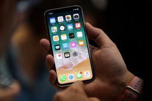
I recently decided to purchase a phone that had more of what I wanted (battery life!) and less of what I didn’t (news alerts, social media notifications, emails). I used to have a device exactly like this—a flip phone that could last a week on a single charge, and that didn’t act like a supercomputer that trained all its gigaflops on distracting me.
So I marched into my carrier’s storefront and was disappointed to learn that I had exactly one option. It wasn’t that cheap. It included a clunky browser and was cluttered with all sorts of other apps I didn’t want. It also had terrible reviews; people said it broke down quickly and often. Not that any of that mattered, because I had no choice. I bought it—and it broke within months. I marched back and asked if they had acquired any other models. Dejected, I bought the same phone again.
I promise, it’s not that I like to overpay for crappy products. I just think that there’s a good case to be made that it’s in our best interest to move away from ever-more-powerful computing machines and toward, well, decent one-trick ponies. That’s because the multipurpose computer—your smartphone, with endless tiled apps, or your laptop, with another tab always ready to open—makes it harder for you to align your own incentives with what your device is capable of doing.
In 1971 the social scientist Herbert Simon anticipated the attention economy when he wrote that in an information-rich world, the most scarce resource is the one that information itself consumes: attention. “A wealth of information creates a poverty of attention and a need to allocate that attention efficiently,” he wrote. Here’s how the designers of our devices, social platforms, operating systems, and websites have decided to allocate our attention: They have placed a bounty on it, monetizing our data and our gaze. Advertisements and other types of persuasive communication—political ads, entertainment, social media alerts—are all gunning for that bounty.
Sure, sometimes you’re in control. Sometimes that new tab you’ve opened in your browser tells you something useful. Sometimes you dearly want those notifications: a text from a loved one saying they’ve arrived safely, say. But the important thing to realize is that, on balance, the notifications and interruptions emanating from your device are not fine-tuned to your priorities. They’re social Darwinism on a screen. It’s a game of every app and ad for itself. It’s as if we are letting a slew of demanding toddlers run our whole lives.
Even the most benign forms of convenience afforded by our devices—like the ability to look something up while reading—can work against attention conservation. Finishing a book or a long article requires focusing for lengthy stretches of time. But according to one study, it takes us about 25 minutes to return to a task once we’ve been interrupted.
Even if you never succumb to the temptation to click away, the video ads and blinking lights on the periphery of a website take their own toll. Another study found that advertisements on web pages, unsurprisingly, disrupt the reading we’re trying to do there.
Which brings me to my favorite device, one that proves another world is possible: the e-reader, a product category that has become almost synonymous with Amazon’s Kindle. Let’s get the obvious problems out of the way: It’s not great that we seem to merely rent our books on the Kindle rather than truly own them. (Amazon can take them back!) And Amazon’s surveillance via the device isn’t welcome. (The company tracks what we linger on and what we don’t.) Plus, ideally we’d be able to choose between a few more competing versions.
But as a device for reading, the Kindle is excellent. And it’s not just because e-ink is softer on the eyes; it’s because there’s not much else to do but read. The Kindle’s quasi-functional web browser is not at all tempting outside of an emergency. And there are no notifications. I read better on the Kindle than on anything else—aside from the original no-notification technology, the physical book. Alas, books made of paper are heavy, and it’s hard to always have one around. So Kindle it is.
This isn’t an advertisement for a product; it’s an attempt to highlight how incentive structures matter in design. The Kindle is made by a company that makes money when it sells books. So our incentives are aligned: I want to read books, and Amazon wants me to read books. I don’t believe the alignment is as clear-cut on any other computer I own.
For a while now, “digital detoxing” has been a fad. There are spas, camps, training programs, weekend getaways, web pages, and more that promise to help us break our phone and computer addictions. A better focus would be to understand why the current standards of design set us up to fail. What we perceive as failure (becoming distracted) is success for those designs. Competing to distract us is the point of many of our digital tools.
Maybe it’s not us but our phones that need detoxing. If the designers of our technology shifted to a business model that better aligns their incentives with ours, maybe I’d finally be able to find a flip phone at my local store that isn’t so crappy.
Zeynep Tufekci (@zeynep) is a WIRED contributor and a professor at the University of North Carolina at Chapel Hill.
This article appears in the October issue. Subscribe now.
More Great WIRED Stories
- What is Wi-Fi 6, and when will I get it?
- These hallucinatory landscape photographs will blow your mind
- One scientist’s quest to bring DNA sequencing to every sick kid
- We can be heroes: How nerds are reinventing pop culture
- Supermicro bug could let “virtual USBs” take over corporate servers
- 👁 How do machines learn? Plus, read the latest news on artificial intelligence
- 🎧 Things not sounding right? Check out our favorite wireless headphones, soundbars, and bluetooth speakers


